Breathing Space
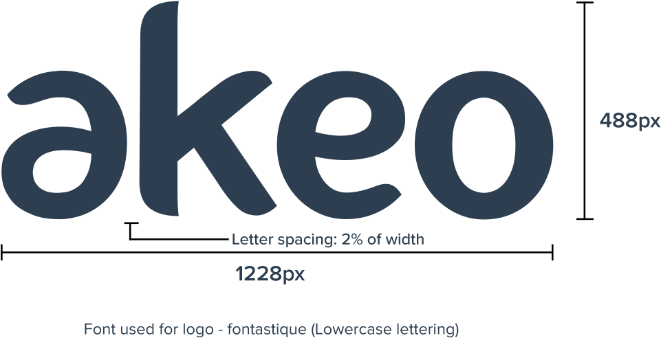
Logo in use
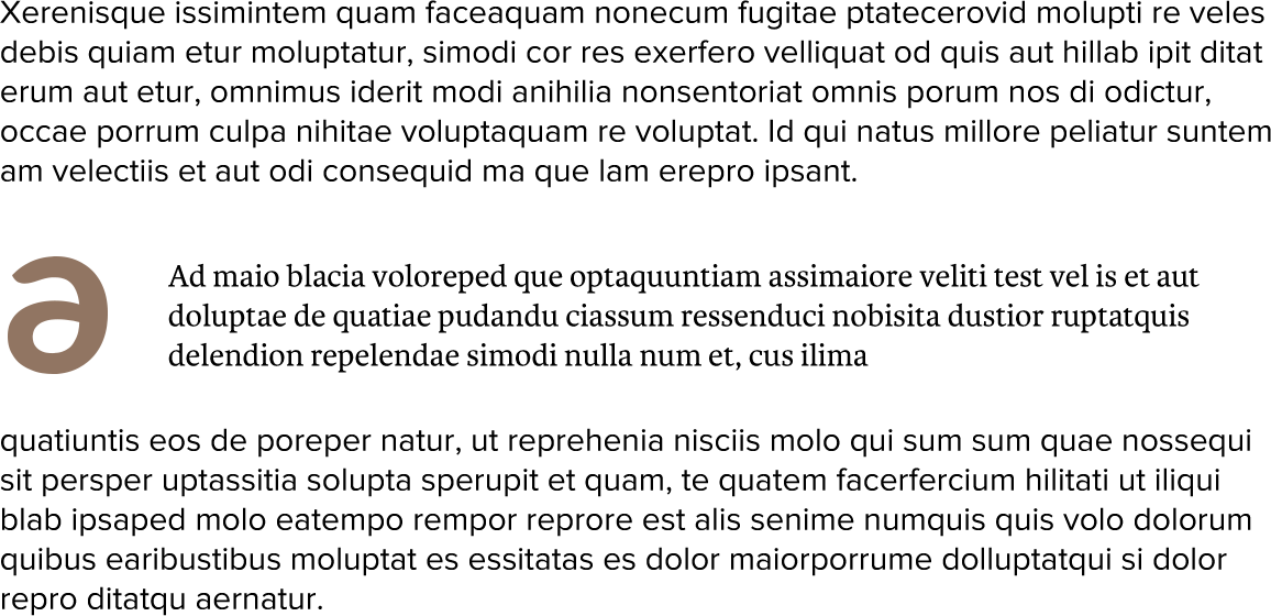
The 'a' Element
It can never be used instead of the main logo. The A can be used as a stand-alone element or be applied with other design elements.
We turn your ideas into reality
Animation patterns
Colors
be used for the word-mark branding.
Primary Colors
HEX : #2c3e50
RGB : 44 62 80
CMYK : 85 69 37 49
HEX : #FFFFFF
RGB : 255 255 255
CMYK : 0 0 0 0
Highlight Color
Preferred Background Color (Web)
SEcondary Colors (For icons and graphics. Minimum usage.)
HEX : #917562
RGB : 187 164 153
CMYK : 28 34 37 0
HEX : #c9c3b6
RGB : 201 195 182
CMYK : 22 19 27 0
HEX : #a8653b
RGB : 168 101 59
CMYK : 27 64 85 14
Extra Color (For icons, graphics & hyperlink use only. Minimum usage.)
Gradient Colors
#a8653b to #804723
#c9c3b6 to #9b9489
#b6cb58 to #8ba12a
Tint Colors
HEX : #2c3e50
HEX : #4e5766
HEX : #6d7381
HEX : #9597a3
HEX : #c3c3cb
HEX : #a8653b
HEX : #b77d58
HEX : #c59776
HEX : #d7b59c
HEX : #ead7c8
HEX : #c9c3b6
HEX : #d8d4ca
HEX : #e2e0dc
HEX : #f0efed
HEX : #f7f7f7
HEX : #b6cd59
HEX : #c2d57b
HEX : #d1de99
HEX : #dfe8bb
HEX : #eff3da
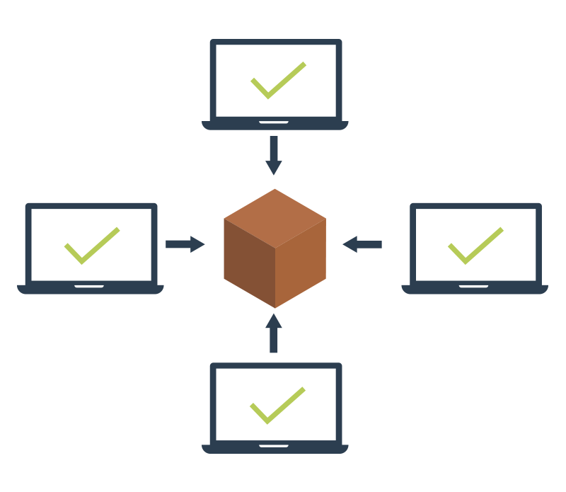
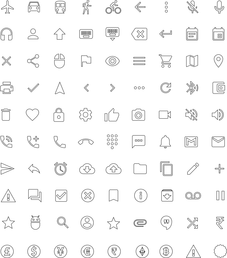
Graphics & Iconography
with much air/space or negative space in it.


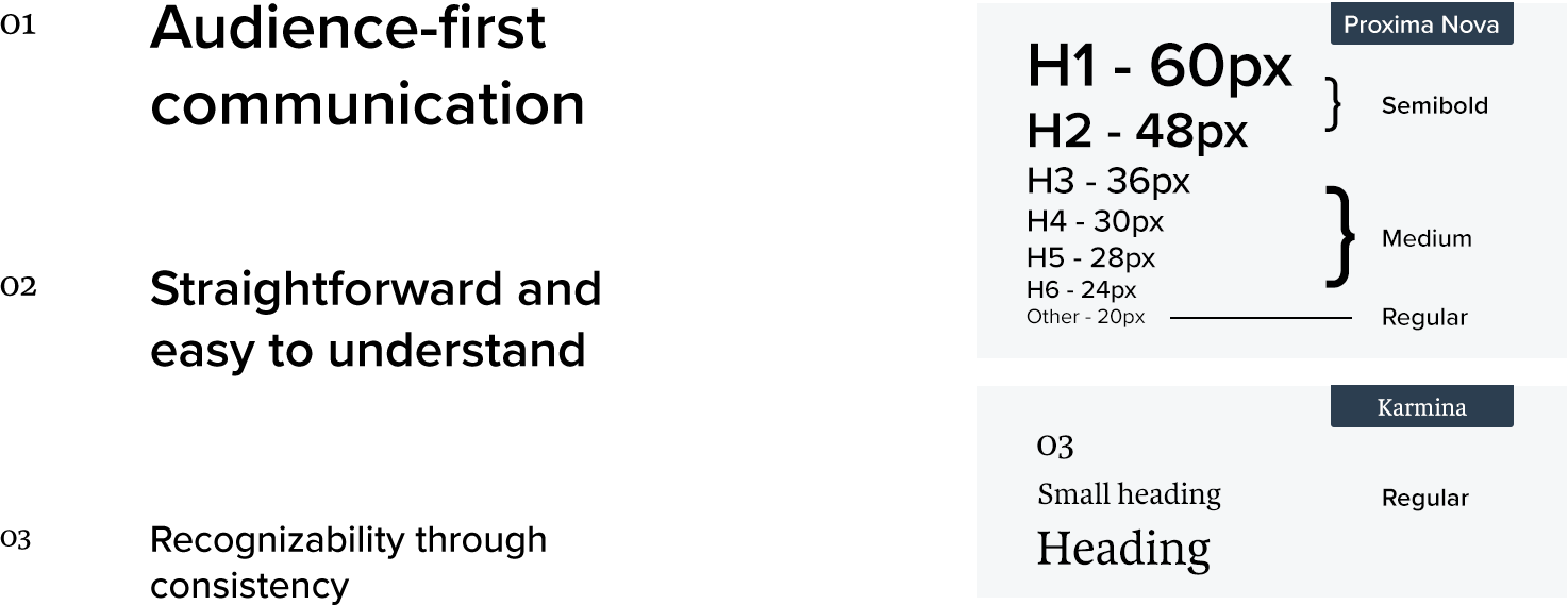
Typography
The Akeo Typography uses two font typefaces for a better impact to user, and to emotionally express our Technical aspects.
There are two typefaces that can be applied to the Akeo Brand. No other typefaces should be used. Both typefaces can be used on both print and web.
• Karmina shall be used for small titles (upto 2 words), subheadings, numbers and quotes. Use sentence case.
• Proxima Nova being a bold font can be used for all text styles. It shows boldness of us.
–> For H1 and H2 Proxima Nova Semibold to be used.
–> For H3, H4 and H5, Proxima Nova Medium or Proxima Nova Light to be used as per requirement.
–> For body text, Proxima Nova Regular to be used.
The typeface can be used in any font weight depending on the background color and contrast. Keep appropriate margin space, line space and paragraph space.
Lorem ipsum dummy text
Your content goes here. Edit or remove this text inline or in the module Content settings. You can also style every aspect of this content in the module Design settings and even apply custom CSS to this text in the module Advanced settings.
Lorem Ipsum is simply dummy text of the printing industry
Your Title Goes Here
 Lorem ipsum dummy consectetur
Your content goes here. Edit or remove this text inline or in the module Content settings. You can also style every aspect of this content in the module Design settings and even apply custom CSS to this text in the module Advanced settings. Learn more
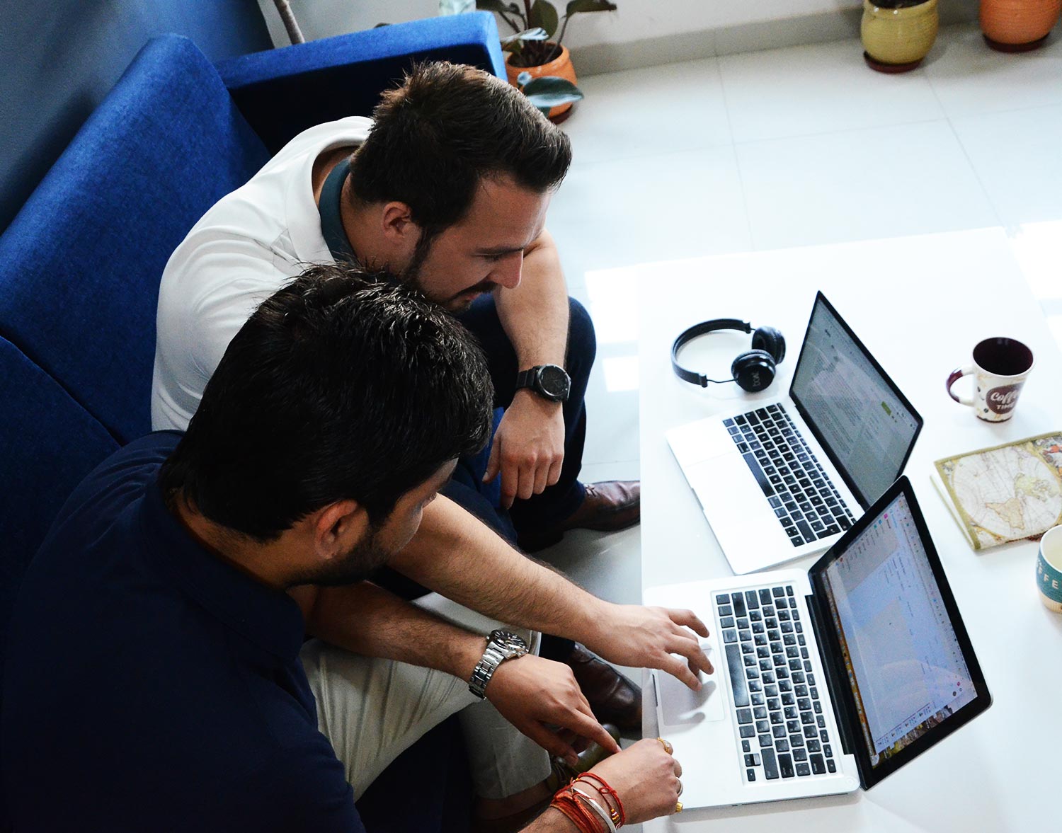
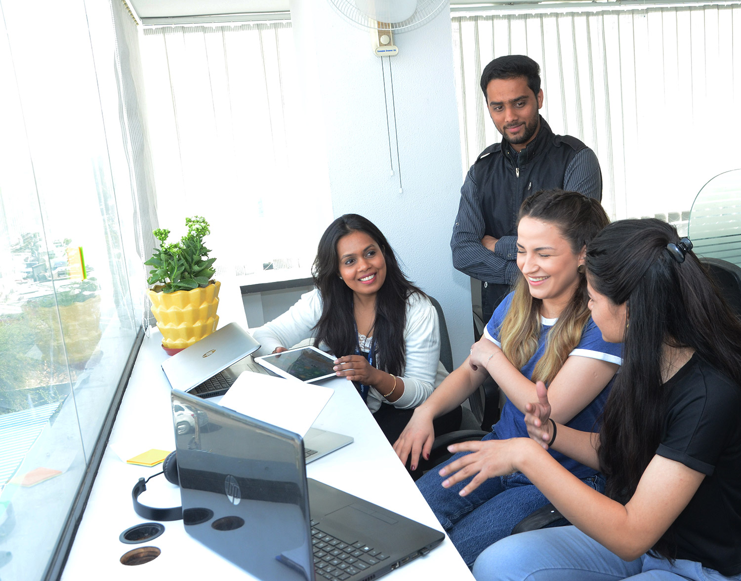
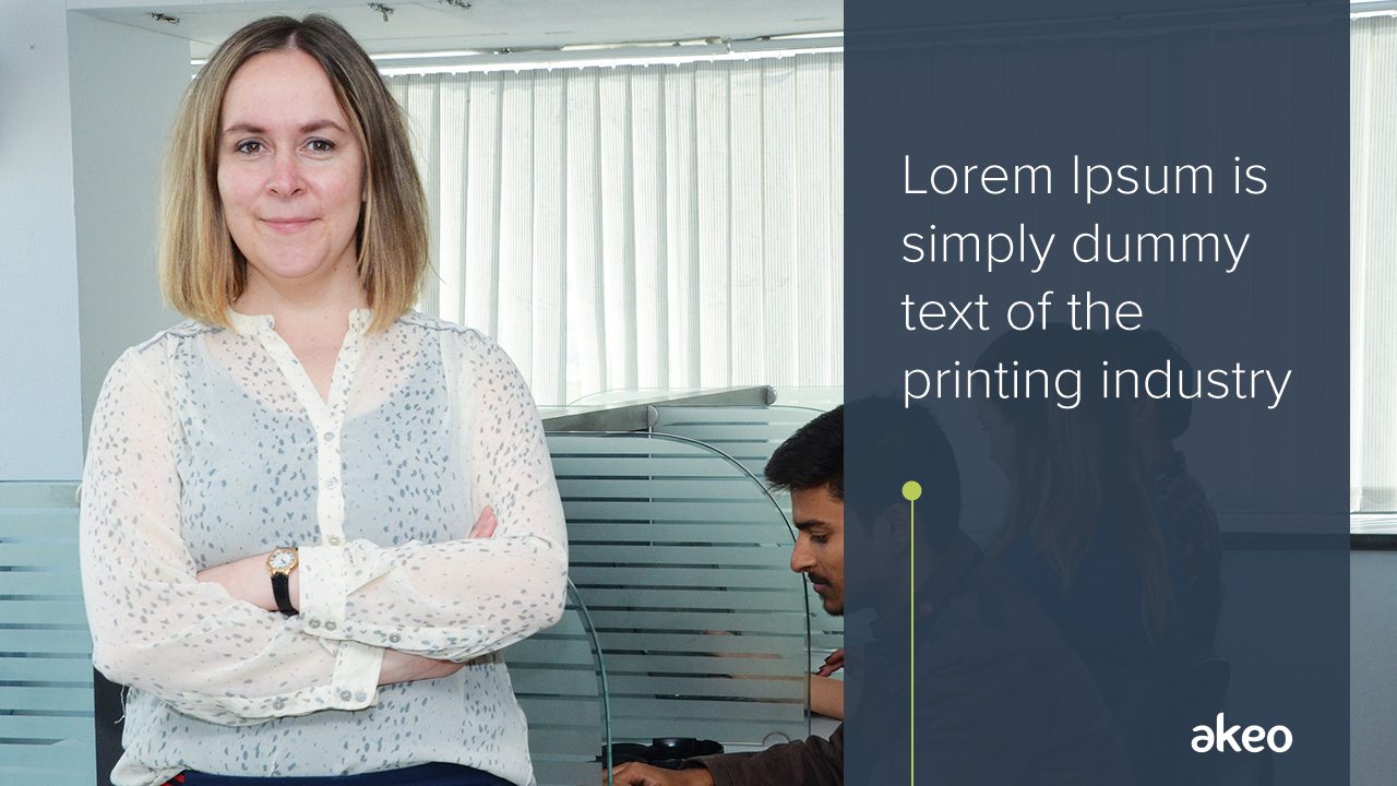
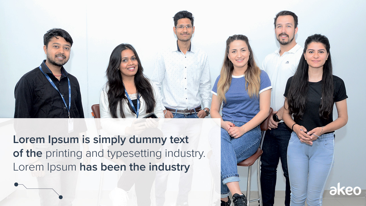
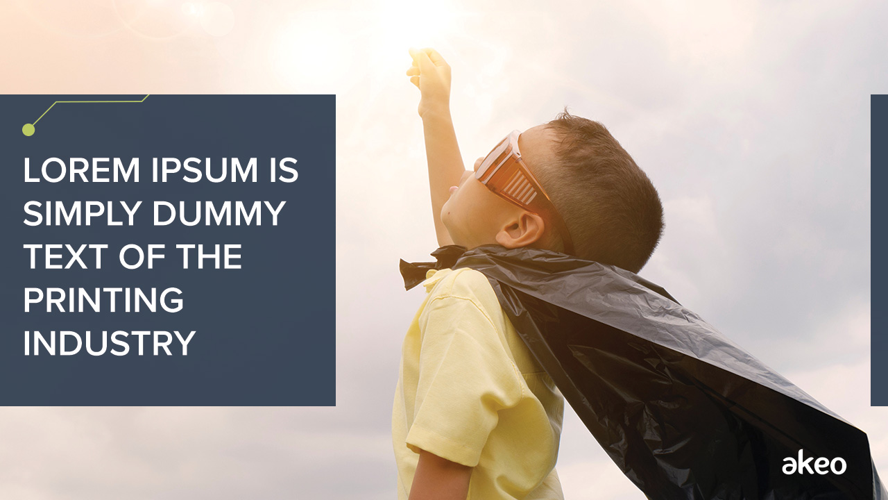
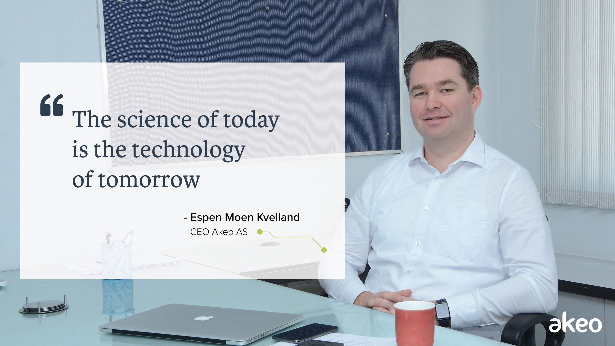
Photography
The pictures should be soft, emotionally attached with content and have delineated
space in relation to the content. Use of technology in the picture should be inspiring.


Graphic Patterns
Various options

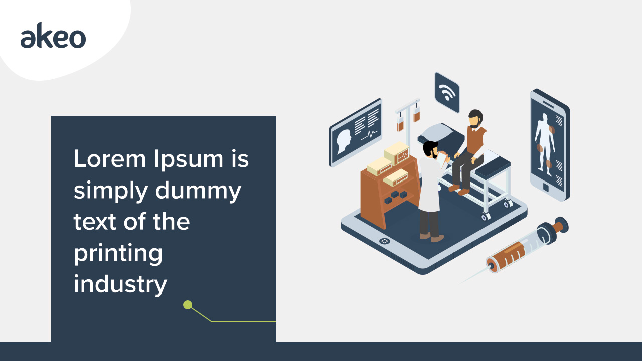


Banner Sample
Various options


Hubspot Inbound Marketing
Hubspot banners and workflows have been designed to convert customers landing on pages. Workflows are better designed with chatbots and automation for conversions.


Button Design
Button Hover effects
Paragraph Section
Lorem ipsum dummy text
Your content goes here. Edit or remove this text inline or in the module Content settings. You can also style every aspect of this content in the module Design settings and even apply custom CSS to this text in the module Advanced settings.
Lorem ipsum dummy text
Your content goes here. Edit or remove this text inline or in the module Content settings. You can also style every aspect of this content in the module Design settings and even apply custom CSS to this text in the module Advanced settings.
Lorem ipsum dolor sit amet, consectetur adipiscing elit, sed do eiusmod tempor incididunt ut labore et dolore magna aliqua.
Card sample
Sub title text here
Your content goes here. Edit or remove this text inline or in the module Content settings. You can also style every aspect of this content in the module Design settings and even apply custom CSS to this text in the module Advanced settings.
 Sub title text here
Lorem ipsum dolor sit amet, consectetur adipiscing elit, sed do eiusmod tempor incididunt ut labore et dolore magna aliqua.
Sub title text here
Lorem ipsum dolor sit amet, consectetur adipiscing elit, sed do eiusmod.
CTA Samples
The call to action buttons will be part of a webpage, landing page, or blog, that will act as a hook to engage the audience. In marketing, CTAs will help us convert a visitor, or reader into a potential lead and can drive a variety of different actions depending on the content’s goal.